

As you may be aware, I try to feature an example of what I think is a great comic book cover each month. However, I think it’s a good idea to dedicate, from time to time, an entire blog post to a perhaps lesser known cover artist and show a few of their great covers. It’s been a while since I’ve done so (I’ve actually only done this once before when I featured Ernest Nordli), I thought I’d give a gander at some of the work of George Wilson.
Wilson was exclusively a cover artist who illustrated covers for Dell and Gold Key from the 1950s into the 1970s. He never did interior art in comic books. He was a trained illustrator who brought his skills to creating eye-catching action poses for such Dell/Gold Key titles as Turok, Son of Stone; Tarzan of the Apes; Ripley’s Believe It or Not; The Phantom; and Lost In Space to name but a few.
His illustrations featured realistically rendered people (males mostly) doing battle against some kind of foe, be it human, animal, robot, dinosaur, or some mythical creature. There were also covers with people being menaced by ghosts, monsters, or aliens. He did covers depicting scenes from conventional war to outer space battles.
He always depicted his characters as looking more or less like regular albeit very fit human beings. There were no super-muscled men and women on his covers. That wasn’t the kind of stories Dell/Gold Key assigned him to. Even the more conventional superhero-type characters of the robot fighting Magnus and Doctor Solar looked more like Olympic athletes than the Hulk. More William Holden, less Lou Ferrigno.
Wilson’s covers were all full color paintings, not line art with color fill. And it is clear he used models. I can’t be certain, but a similar male face shows up from cover to cover, could those faces have been his?
His is not a name we hear often when talking about great artists in comic book history. That’s a shame because his work was consistently great!
Let’s look at four pretty good covers, shall we?

Turok, Son of Stone #13 (September-November 1958): This series had our hero battling a lot of dinosaurs, apparently. I love the swoop of the brontosaurus’s neck. The rendering of the dinosaur may no longer be anatomically accurate, but it’s dwarfing of our heroes is terrifically done.

Boris Karloff, Tales of Mystery #13 (March 1966) Another number 13 cover, is there a pattern here?! Maybe not.
That face created from the fumes wafting from those urns is superb. There’s anguish mixed in with anger on that green visage. And Wilson’s use of the lantern to provide the light source for the scene is nicely done.
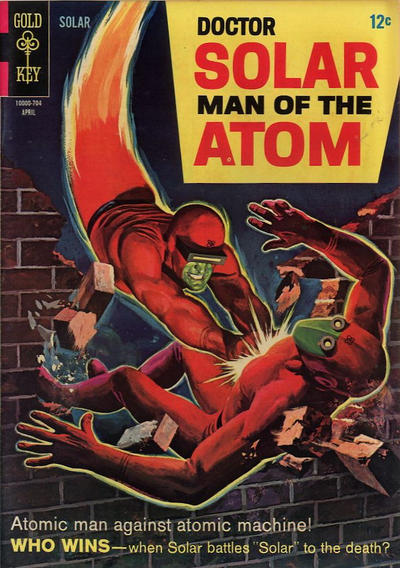
Doctor Solar, Man of the Atom #19 (April 1967) Hey, it’s not number 13.
Anyway, this is just terrific. The determined grimmace of our hero’s face, the glowing yellow outline making the villain pop off the the page, and those hands! So good!

The Twilight Zone #43 (May 1972) Talk about intense! This cover is almost photographic. That expression on the bellhop’s face, his uniform, the pose, those hands! Wow! How did he model that position? The buildings and the traffic below are rendered just enough for the feeling of realism. And is that a window washer or is it Batman in civilian clothes scaling the building?
Holy falling bellboy! This is a great cover!
Well done, Mr. Wilson!
(Two sources used for this blog were The Lambiek Comiclopedia and Paul Tobin (Dot) Net.)
Packing Peanuts!
Feel free to comment and share.
Images used under Fair Use.
Warehouse Find is the official blog of NostalgiaZone.com, where you can find books, games, toys, cards, and a huge selection of Golden, Silver, Bronze, and Modern Age comic books. Jim also has a podcast called Dimland Radio. He’d love it if you checked it out. It’s available on iTunes.
